
Next Steps in TMog & Photoshop
By Bunny Wuffles
 This
tutorial consists of several steps, all hopefully easy to follow, and
I am assuming you followed Carmilla's first tutorial in recolouring. If
you didn't, you really should go back and take a look.
I use Photoshop 5.5, but I think the basics are pretty much the same (if not easier) in PSP. I am assuming that you may not be too familiar with many of the Photoshop tools I am using - so forgive me in advance if I sometimes sound a little too basic ;o)
During the course of all this, you will learn how to retexture objects to change the look of them without changing the shape. First of all, let's do something more interesting to you than a brown chair. That is, unless you happen to LIKE brown chairs =:o You will also learn a LOT more about Photoshop and what it can do. This tutorial may look very long but PLEASE do not let this put you off - much of it consists of valuable Photoshop tips and tricks as well as general moggery.
I thought we could try doing a customised easel. That way, your sims can impress you with their new-found artistic talent, and you can impress your friends with your new-found transmogrifying talent by making them an easel or two :o)
Ok, it's time to fire up Photoshop, as you need to find four pictures to put on your easel. Four? But Bunny Wuffles, my sims only paint three! True, but don't forget that the lil sim kids also use the same easel as well. So normally you need four pictures, one for the sim kids, one for beginners, one for intermediates and one for experts.
So first, a Photoshop Tutorial.
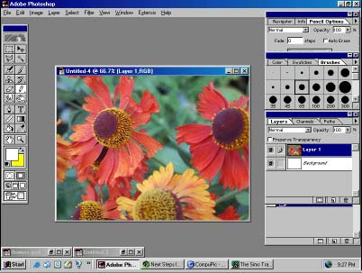 This
is a photo I took in my garden and woah nelly but it's huge. The photo
that is, not my garden :o) Far too big to go on the easel at the moment
so before we even think about opening TMog, we need to resize it.
While we are playing in Photoshop, there are also various things we can go on to do to our pictures to make them look less like photographs and more like paintings.
I will give you this photo below to use to make following this tutorial step by step a lot easier, but of course you can use your own pictures if you like. Whichever, I am going to talk you through some of the things I do to prepare a photo for moggery so you can get to know a bit more about Photoshop.
Firstly, obviously this is HUGE. 640 x 480 pixels huge. The painting on our easel image is only around 75 x 110 pixels, so some serious resizing will have to be done.
There are a number of things we can do to
resize images to shape but the best by far is using the Photoshop Image
Size function. This will make the image smaller while retaining a lot
of its clarity and sharpness.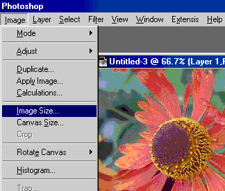
You will recall that we have used the Image menu before - to change a Sprite image mode to RGB. However, further down the Image menu, you will see two options marked Image Size and Canvas Size. The Image Size option changes the size of the entire picture, while the Canvas Size option changes the size of the editable canvas while leaving the image the same. We don't want to do that here; we are shrinking the whole of the picture so click on Image Size, which should bring up a new menu like so:
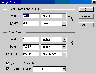
As I said above, 640 x 480 pixels is huge. The painting on our easel image is only around 75 x 110 pixels, but I also want to leave the image large enough to play with before cutting it exactly to shape. Therefore, I am going to downsize it by about a third.
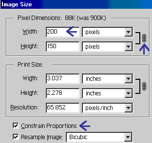 The
drop-down box where in my screenshot it says "Pixels" may not
say this in yours - use the drop-down menu to choose Pixels and this should
then set as your default measurement. I find it much easier to work in
Pixel size than anything else. We are not interested in Print Size so
you can leave those boxes alone.
If you have the Constrain Proportions box checked, this will mean that the picture will stay the same basic shape and not become distorted. It will also produce a little picture of a chain next to your Width and Height boxes, and handily will mean you only have to change one of them for the other to change too.
You can now see that I have typed 200 into the Width box, and automatically, it has calculated that the new Height of the image will be 150. Nifty, eh?
And now, just because I like you, here is the picture we will be editing - now at 200 x 150 pixels. It is a high resolution JPEG image, so you can right click and use "Save Picture As" to save it to your usual editing folder.
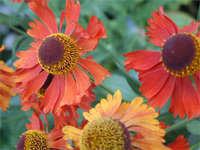
You can always leave the pictures you have chosen as they are for the finished article, but it might be nice to give them a bit of effects work to make them look a bit more like they were painted. If you are going to leave them as they are, you can skip this next bit and scroll down until it says "OK, now we are ready to TMog". But it would be good if you could bear with me and learn some cool stuff with Photoshop, which you will need for the later part of this tutorial in any event.
So next, another Photoshop Tutorial.
There are a number of things we can do to our pictures and even more ways in which to do them. But first, let me say that there are probably plenty MORE ways in which you could do them, but because I am completely self-taught in Photoshop, there are many many gaps in my knowledge. I taught myself by using a selection of books and online tutorials, but as I didn't have the patience to go through them systematically, there are certain things I have absolutely no idea about. So, for the purpose of this tutorial, let me assume that you don't either. Of course, if you do, then by all means do them. It's the end effect of four half-completed and fully completed paintings we are trying to achieve after all, and if you can get there by a way which is easier / better / more attractive to you, then even better!
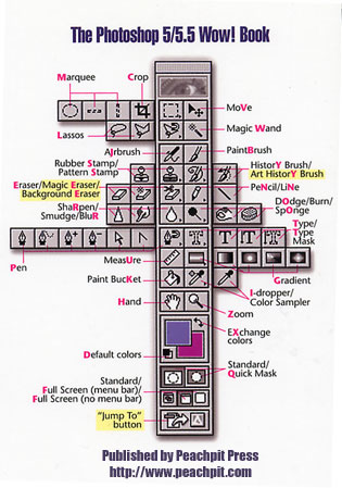
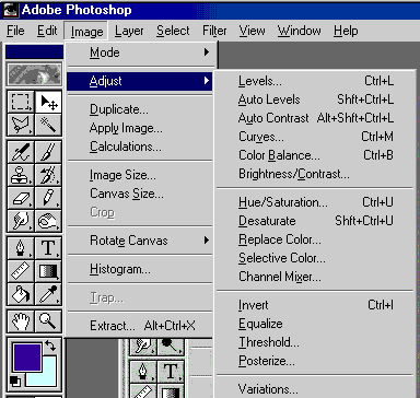
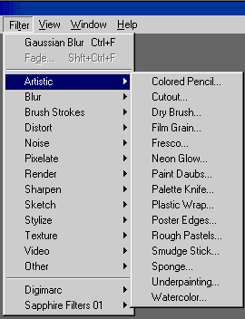
So here's a couple of Photoshop reference guides to keep handy as I will be referring to certain tools / actions during this next part. One is taken from the best book which I have bought so far on Photoshop - "The PhotoShop 5.5 WOW! Book", published by Peachpit Press. Of course, both Photoshop and the WOW! book are now on version 7, and one day I should really get round to upgrading. But for now, these will do me just fine. The screenshots of my version of Photoshop may show different things to yours; I have some plug-ins I bought and installed which you won't have, and if you have a later version than 5.5 you will no doubt have lots of options I don't. But at least by following what I am doing you will know where to go to look for the options - and what the options do once you have found them.
The Photoshop Toolbar ....................................and.................................... The Image / Adjust Menu
The Filter / Artistic menu.........................and.................the Filter / Blur menu
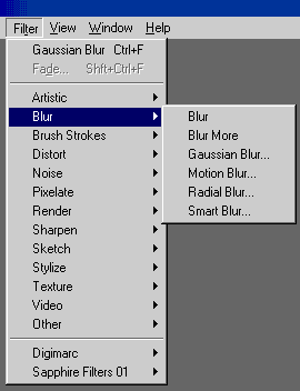
The Filter / Brush Strokes menu ...........and........... the Filter / Sketch Menu
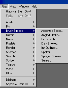
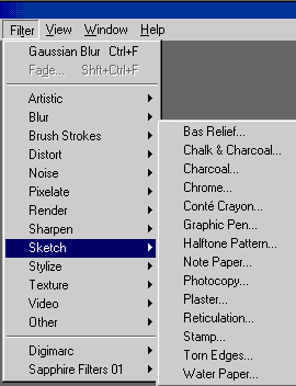
I think you get the general idea by now. If I therefore say something like Filter / Blur / Gaussian Blur, you will know how to get there.
Have a little play around with these menus / submenus, just to see what other goodies lurk inside the inner workings of Photoshop.
OK, now let's get creative with our flowers!
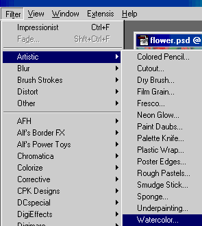 Go
to Filter / Artistic / Watercolor and click. This should bring up another
menu like so:
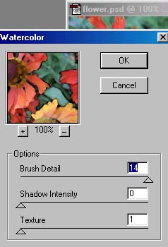 Where
if you play around with the slider bars, you will get a preview thumbnail
of what the entire picture will be like.
Have a fiddle about until you get an effect you like and press OK.
You can zoom in and out of the thumbnail by using the + and - keys just below it.
You can leave it as it is, or you can add a further effect. I am going to use a tool from the toolbar - the History Brush.
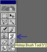 The
History Brush does lots of things, and one of the most simplest is one
we are going to use now to great effect. Double-click
the History Brush tool to display its Options palette.
Set the options palette like so:
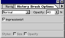
Now select a brush from your Brushes palette, and "paint" in the picture wherever you want the effect to go. Don't forget, you can always use the History palette to go back if you don't like what you have done. I have "painted" around all the edges to soften them up using a medium brush set to the options listed on the palette above. So now here is our picture in all three stages:

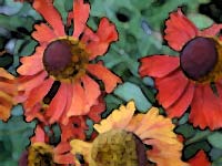
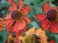
The original picture........................After the Watercolor filter..............After using the History Brush.
And now you can fire up TMog at long last. You will remember that we have to clone the original easel first and make another one that's exactly the same for us to play with. Just to remind you, here's what we are looking for this time:
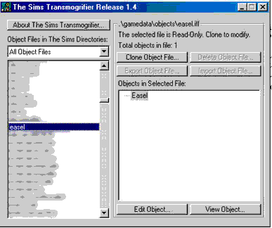
Press the "Clone Object File..." button and the option window appears where you give your new easel its name. It's a good housekeeping point to name all your objects starting with the same thing. You can find them easily in your folders that way, and if you intend distributing your objects (please do!) then it acts as an easily identifiable "makers mark" on your object. All my objects, for example, start with "bun", so I am naming my easel buntuteasel as you will see in the next screenshot.
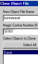
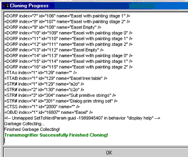
As you can see, the t-mog has automatically selected the easel, so check your cookie number is there, and hit the ok button. Tmog will now clone the object & once it's done, you get the nice green message "Transmogrifier Successfully Finished Cloning!"
This may take a little longer than cloning the chair did because the more things the object does, the longer it takes to clone. Some items, like LoveBeds for instance, take ages to clone in comparison.
Exporting our Object and looking at the Sprites
Our next stage you will recall is that we need to export the sprites from TMog to the folder we made to store our brown chair stuff in.
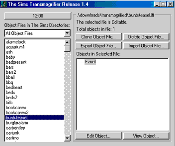 Click
on the "Export Object File" button and.........
..........you get the Export Whizzer window up.
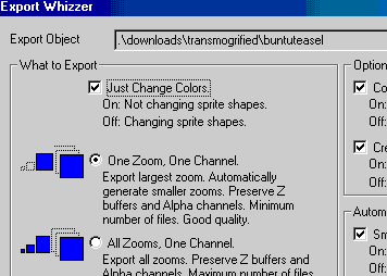
From this window, we decide what things we'll need to alter our object, and you will recall that for a recolour, we only need to tick the "Just Change Colors" and "One Zoom, One Channel" options.
Wait a minute bunny wuffles, you said we were doing a retexture earlier, not a recolour. Ah, well, that is because retexturing is just a fancy name for layering another image on top of a previous image. In the sims world, "retexturing" has become a word to distinguish objects made by just altering the hue / saturation channels like we did with the brown chair, from those objects made with a little more time and attention and a layered image, like our easel will be.
Hit the ok button on the Export Whizzer, and choose the folder you made earlier in the "Save As" window that pops up. Once you've found the folder in the list, click "save". Once again you should get a whole load of gobbledegook with the "Transmogrifier Successfully Finished Exporting!" message at the bottom, with an ok button which you can click now.
We are now finished with the TMog for the moment, so you can minimise it (or close, depending on the performance & speed of your compy). We are now ready to play in Photoshop :o)
In Photoshop, go to File, Open and find the folder you made. You should then be presented with a huge amount of options, looking something like this:
![]() The
first thing you will notice is that there are LOTS more folders than
you had when you recoloured your chair! Eek! Don't let this put you off
though; you will see that some of them we can leave safely alone.
The
first thing you will notice is that there are LOTS more folders than
you had when you recoloured your chair! Eek! Don't let this put you off
though; you will see that some of them we can leave safely alone.
The folder marked sprite0100 is just the easel itself. I'm going to leave it brown so we don't need to do anything in this folder. Take a look at it anyway, just to get a general feel for what we are doing.
The folder
marked sprite0200 contains four files with names like:
Easel-painting-fr-1_large_sw_p.bmp (also ne, nw & se)
These are all the empty canvases from both angles - the front and the
back. I'm also going to leave those blank, so again we don't need to do
anything in this folder but you can take a look if you like.
However, we ARE interested in the folder marked sprite0201. Again, you will see it contains four files, named for compass points ne, se, sw & nw. The sw and nw versions are the back of the canvas so can be left alone. We are interested in the ones named Easel-painting-fr-2_large_ne_p.bmp and Easel-painting-fr-2_large_se_p.bmp which when you open them will look remarkably like this:
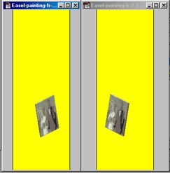
Recognise this picture? It is the first stage of the wedding photograph. You will recall that when your sim paints a picture, he/she takes a blank canvas, paints a while, which then becomes a blurry picture, which gets better with the next stage.
So now we are going to substitute that with our flower picture which we have artistically altered.
Stage Two
Retexturing our object and a brief overview
of Photoshop layers.
In Photoshop, we should now have three images open: the flower photo and the two sprites named: Easel-painting-fr-2_large_ne_p.bmp and Easel-painting-fr-2_large_se_p.bmp. You will recall from the chair tutorial that Carmilla advised the following: "In order to make sure that we don't overwrite our chair too early with some horrible miscolour, the first thing we need to do is save the picture under a different name for safe keeping. This means that, should we make a mistake, we haven't destroyed the original image, and we won't have to go back and go through all the things we've already done to get a clean copy again." So I am assuming that you have either done this or are now experienced enough not to have to do this.
Now we have our sprite images open, we need to change them to an RGB Palette, as we did before - using the Image menu, then Mode, then RGB Color. Do them both, although we are only going to be working with your Easel-painting-fr-2_large_ne_p.bmp to start with. Now we are going to take our new image and paste it over the old one, and this is where Photoshop comes into its own, as we are going to be working in layers.
Photoshop Layers are your new best friend.
Layers, bunny wuffles? Coo, but that sounds complicated. OK, think of it this way.
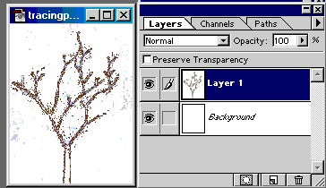
You have a book of tracing paper. You draw a tree on the back page which can be seen through all the other sheets.
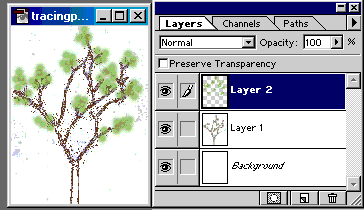
If you turn to a new sheet and draw some leaves on it, the tree now looks as if it has leaves. You are now working in two layers. The grey and white grid in the Layers palette is Photoshop's way of showing a transparency. There is nothing on that layer apart from the greenery. So as you can see from the layers palette, the only thing I have drawn on Layer 2 is the leaves but you can see the tree AND the leaves on the main image.
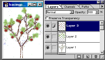
Take a third sheet and draw some apples on it. Three layers.
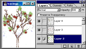
But now, you don't want so many leaves, and perhaps need an extra branch on the tree.
You can easily turn to each page and alter it accordingly while seeing the effect it has on the other pages, but while keeping the other pages intact. I added Layer 4 for the new branches and went back to Layer 2 and erased some of the leaves.
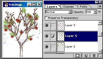
You can also add pages inbetween any of the others without affecting the other pages. The new layer is inbetween 2 and 3 but it is the 5th layer I have added to the image. Inserting images in this way will be useful when we go on in a later tutorial to learn the "Merge Down" command.
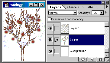
You can even tear pages out without affecting the other pages. Here I have deleted Layer 2 completely. Again, this becomes useful when Merging.
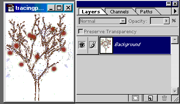
It is not until you are completely satisfied with all of the pictures that you get the glue out and stick all the layers together to make one picture of a leafy apple tree. In Photoshop, the "glue" is either Flatten Image - which we did in our brown chair tutorial or Merge Down which we will learn more about in a later tutorial but is basically "selective glue" used to just stick some of the pages together
So you can see, Photoshop layers work in much the same way as tracing paper :o)
OK, back to Photoshop and our painting. The painting on our easel image is only around 75 x 110 pixels, but our flower picture although drastically reduced in size is still too big at 200 x 150 pixels - and is the wrong shape, being landscape rather than portrait.
You will therefore need to go back to your Image menu and then the option marked Image Size which when you click on it should bring up the menu where you type in the size closer to what you need. I have typed in 100 for the height which is reasonable.
Go to the Select menu, choose All and watch those lil ants run around the edge of your picture.
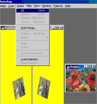 Ctrl
C to copy the picture. Click on your Easel-painting-fr-2_large_ne_p.bmp
image and Ctrl V to paste the new one on top (RH pic below).
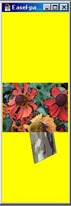 Aargh!
What have I done?
Actually,
there is no need to worry. Remember the tracing paper? Well, in the image
next to where it says above "So first, a Photoshop Tutorial",
you will see that I have a window open called Layers. If
you don't have this window open yourself, now is the time to open it!
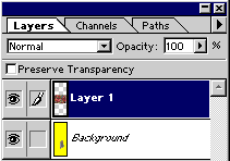 Go to Window
on your action bar, then select Show Layers. The lil window will
then pop up somewhere where you can then move it to where it is convenient
on your screen. These lil windows are called Floating Palettes.
I also like to have my History palette showing, as this works like
a multiple undo / redo facility (which we will use shortly), and my Color
palette showing, as this shows us various brush sizes for some tools which
we will also use shortly. So do the same for those palettes too.
In your
layers palette, you will see that we have two layers - one called Background,
and the other one called Layer 1. I have Layer 1 highlighted, which means
I can edit the flower picture as much as I like without altering the background
image. Which is good, as I am now going to edit it again. A lot.
At the moment, our flowers are no use to us at all, as they are still not only too big - wayyyy too big - but the image is also facing forward and not towards the North East, as our image is. So we need to grab the flowers image again, but this time using the Edit menu, then selecting Transform, then Skew.
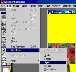
This
will give a boundary box around our flower image. You will see that there
are 8 little boxes at various points around the boundary box, and a target
shaped one in the middle. Grab the box that I have shown next to the blue
arrow. 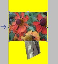
You can skew the image up and down using this box, and you will notice that it retains the overall shape. Using this box, skew the image down until it matches the angle of the picture in the background. Like so:
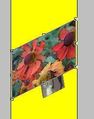 Once
you are happy that the angle is the same, you can move the skewed image
down to match up with the bottom of the wedding photo image. Do that by
grabbing any part of the flower image within the boundary box, but avoiding
the target shape in the centre.
Next, we are going to rescale our flowers to fit. With the boundary box still showing, go to the Edit menu as before, selecting Transform, then Scale.
Your boundary box won't look any different, but oh boy will it behave differently. The first thing you will notice when you mouse over the little boxes is that your cursor will now show some directional arrows. For the moment, I want to keep the flower image the same shape, just a smaller size. This can be done by holding down the Shift Key while pulling the appropriate box. I have selected the box as below and it didn't need much rescaling to make it fit over the wedding photo image.
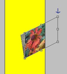
OK, this
is starting to look more like it. 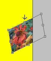
With the boundary box still showing, go to the Edit menu as before, selecting Transform, then Skew again. This time, we will be skewing it to fit the angle of the picture as it sits on the easel. I have selected the box as below:
sorry for the poor quality of this image, but I am trying to save as much bandwidth as possible :o)
Wahey! This is REALLY starting to look more like it. To move the image into its final resting place, I generally use the Zoom tool to enlarge the image and work from the bottom left hand corner of the wedding photo to line the whole thing up.
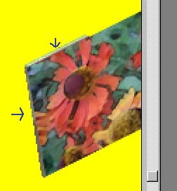 Try
to leave the canvas frame side & top (marked with the blue arrows)
as it is because this gives a nice 3D effect to the whole thing.
Once
you are satisfied that the skew angles and size are identical to the wedding
picture, AND the part of the flower picture you like the best is on top
of the wedding picture, deselect the boundary box by selecting the Move
tool on your toolbar. 
However, the picture is STILL much bigger than the easel picture would be, and our next step is to erase the unwanted bits - and you will be pleased to here that there is a nifty way to do this with Photoshop.
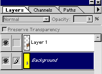 Go
back to your Layers palette, and highlight the layer called Background.
This is your yellow sprite image with the wedding photo on.
We are
going to use the Magic Wand tool and you should bring up its Options
palette so that we can set the Magic Wand how we need it. I will explain
more about the options here in a later tutorial, but for now just set
it as I have shown in the picture below.  Options palette not showing and you can't remember how to bring it on
screen?Just double click on the Magic Wand tool.
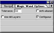
With the Magic Wand, click anywhere in the yellow of the sprite image. It MUST be the yellow, not in the wedding photo by accident.
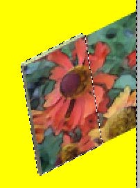 Wheeeee!
It's Ant Marathon Time again! Just watch them go around the edge of the
yellow sprite, around the edge of the wedding photo, and....wait.....where
are they going now? Down the middle of the flower picture?!
That is because we are working on the layer UNDERNEATH the flowers, and the running ants simply don't acknowledge the flowers' existence. Which we will now use to our advantage.
While the ants are still running, go to your layers palette and click on Layer 1 to highlight it.
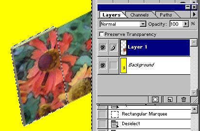 Now
from your toolbar, select the Eraser tool and choose a nice large brush
from your Brushes palette.

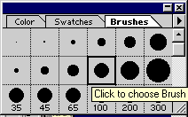
And now, take your Brush and while those ants are still doing their marathon, making sure you have Layer 1 highlighted, scribble away and look what happens! You are erasing all the image which lies outside the base object of the wedding photo, while leaving the image we want to keep intact.
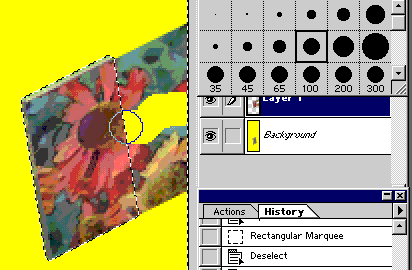 I
am sure you will agree that this is a very nifty tool indeed, and another
advantage of working in Layers.
Carry on until you have got rid of all the bits of the image we don't want.
And now to make our flowers look as if they are only half-painted. Remember, the original wedding photo was only at its halfway stage. More fun & creative bits coming up - but don't deselect and stop that Ant Marathon just yet.
Stage
Three
More filters and effects
Because
we are working in layers we can do all sorts of things to our flower picture
to make it look as if it is only half painted, all
without affecting the background image at all. But keeping our workspace
tidy is a good habit to get into, especially when we move onto the next
tutorial of adapting a sprite image, and some filters (especially plug-ins)
DO alter all the layers, so to do this safely first time, we are going
to use the Magic Wand again.
You will
see that we have not one, but two sets of running ants on Layer 1 - that
is because we haven't actually selected anything - just the invisible
bit which surrounds our flower image.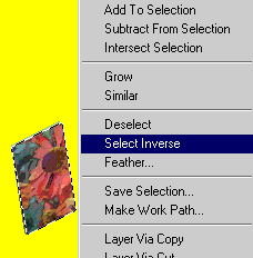 As it is the flower image itself we want selected, right click
to bring up a new menu and choose Select Inverse. This gets rid
of the outer ant colony, and we are now left with one smaller ant race
- around our flower image. Any editing we do while an area is selected
in this way will be confined to the selected area only - as you saw above
when we were erasing the excess flower image.
And now the fun begins! Make sure your History palette is showing, as mentioned above - you will need this to reverse any steps we do now that you don't like. I'm also recommending you save your work at this stage. You can keep it in the same folder and with the same name, but it does need to be saved as a .psd document - that is a PhotoShopDocument - as we still want to keep our layers separate for the moment. Remember where you have saved this to, as we are going to be going back to this image again in a future stage.
OK, you can choose whatever filter you like. Depending on the image type, different filters can be very effective and some not. On some pictures, I use Filter/Sketch(or Others)/Chalk & Charcoal, but on this flower image that filter looks rather boring.
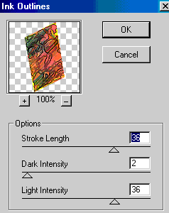 Have
a play around with them until you get the sort of thing you would think
your sims would paint a half-finished picture of a large flower. Press
OK when satisfied, and watch your flowers take on board the new attributes
of whichever filter you have chosen.
I have chosen Filter/Brush Strokes/Ink Outlines.
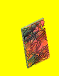 Yup,
I'm happy with that. If I wasn't, I could go to my History palette,
undo it and start over.
And now,
an easy bit! You will recall that we had two sprites of this easel image
which you changed to an RGB Palette
(Image / Mode / RGB Color) . So far, we have only been working
with Easel-painting-fr-2_large_ne_p.bmp.
All we
have to do now is copy our changed flowers and paste them onto the second
sprite, Easel-painting-fr-2_large_se_p.bmp. Leaving the running
ants where they are, ctrl-c copy & ctrl-v paste the new image onto
your second sprite. 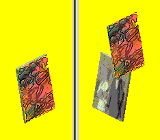
EEK! No, no worries really, don't forget that as we are working in layers, this second layer can be altered to our heart's content without ruining the background. We need to move it into position and turn it round. Edit / Transform / Flip Horizontal and then use the Move tool from your toolbar to put it into place. Don't be afraid to use the magnifying glass Zoom tool to enlarge the workspace so you can line it up precisely.
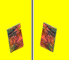 If
you are happy with this image, we are now ready to glue the layers together.
Layer / Flatten Image. You can now see from your Layers
palette window that we only have one image now, called Background.
The half-finished wedding picture has now gone forever (unless you use
the History palette of course). Anything we do to the image from
this point will be done to the entire image - lovely yellow background
and all.
Go back to your original sprite Easel-painting-fr-2_large_ne_p.bmp where you will see that those ants are still doing their marathon. As we don't need them anymore, to give them a rest, go to Select / Deselect. Then Layer / Flatten Image as before. We also need to change the palette from RGB back to Indexed by doing Image / Mode / Indexed / Selective. Because we have changed the palette, we have to flatten the image yet again - so Layer / Flatten Image as before.
You can now save these sprites by overwriting the original ones into the same folder. File / Save As / Easel-painting-fr-2_large_ne_p.bmp. Make sure that the Format list is set to BMP as TMog will not recognise anything else :o) Do this for both sprite names.
We can now go back to the Transmogrifier
to have a look at what our sims will be painting! Minimise Photoshop,
and bring up TMog which we left open in
the background. All being well, it should still have our easel selected
as we left it, so all we need to do now is Import it from the folder
back into TMog.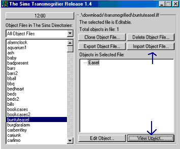
Click Import Object File.
Again with the gobbledegook, until Transmogrifier tells you that it has "Successfulluy Finished Importing!" . Yes, even programmers can make spectacular typos.
Now click View Object.......
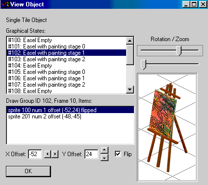 ....and
here our flowers are in all their unfinished glory!
Click the other Graphical States options to see the other paintings, including the lil kid one.
Slide the Rotation / Zoom bars to see the easel at the other rotations and zooms from the game.
Click the white grid background to turn it into a black grid background. This will come in very useful in our next tutorial of adapting sprite shapes, where we get very familiar with that lovely yellow background colour.
DO NOT be tempted to click the X Offset and Y Offset buttons. They can be left safely alone. Again, these are for a later tutorial.
OK, this is the first stage of our easel completed!
Press OK and minimise TMog, and bring Photoshop back up. Remember our folder of sprites?
![]() Well,
we have now almost finished with sprite0201, so we can open the next folder,
sprite0202. Hang on, Wuffles, what do you mean "almost finished"?
Well,
we have now almost finished with sprite0201, so we can open the next folder,
sprite0202. Hang on, Wuffles, what do you mean "almost finished"?
Well, remember I asked you to save your little resized and reshaped flower picture as a .psd document in that folder because we were going to go back at a future stage? Well, now IS that future stage :o)
Go back to it and open it up again.
Your layers should still be intact, which is what we want. Highlight Layer 1 on your layers palette, on your action bar Select / All, then copy & paste.
The folder
called Sprite0202 contains four images named for compass points as before.
Again, we are only interested in the two with the picture facing the front,
which you may recall are the ones named for the SE and NE points of the
compass. 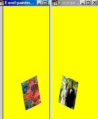 Easel-painting-fr-3_large_se_p.bmp
and .......ne_p.bmp should be the two rotations of the completed wedding
photograph.
We want to replace this with the completed flower picture, so, following the exact same steps as before, change the mode of the sprites, copy and paste the little flower image, reversing and moving where necessary.
Flatten as before, save as before, and import into TMog as before.
You should now be able to view the two versions of your flower painting.
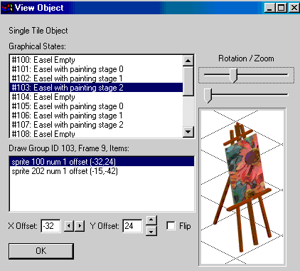 WAHEY! Your sims can now paint a gorgeous big red flower!
Now all you have to do is repeat all of the above stages with your other three pictures.
This is not as daunting as it sounds, as you will soon get the hang of doing all the various actions almost automatically.
Remember we did the Ink Outlines option for our half finished flower? Well, why not play around with some other options until you find ones you like. Don't forget you can use the History Brush and also the Art History Brush as well as filters. Don't be afraid to experiment - if you don't like the effect you can always cancel it by going back to a previous state using the History palette.
The more you do this, the quicker it gets, believe me. I still can't believe that my original brown chair took me an hour - I can now do it in exactly the same way in a matter of moments. And you will be able to soon now as well.
OK, one more point of housekeeping before I finish. You are probably finding now that you are clogging up your Sims folder with .xml files and folders of sprite maps. The good news is that you do not have to save these once you have finished TMogging your object. Once you are satisfied that your object works in the game and you don't want to alter it any more in TMog, you can get rid of both the folder and the .xml file.
I don't delete them all though; depending on what they are I move them out to a folder in My Documents which I call "Spare Sim Stuff" or one called "Sprite Maps" . Why? Well, because I am a hoarder by nature, but more importantly, you never know when you will need sprite shapes again. As we will find out when we attack some plant life in our next tutorial :o)

