Making a totally new object!
By Bunny Wuffles
|
Please don't be put off by the length of it. Take it nice and slow, step by step with me along the way and like all the other tutorials, by the end of it you will be proficient in many new and shiny things. As you know by now, I use Photoshop 5.5, but I think the basics are pretty much the same (if not easier) in PSP, and I assume pretty much the same in later versions of PhSh. However, as always, I am assuming that you may not be too familiar with many of the Photoshop tools I am using - so forgive me in advance if I sometimes sound a little too basic ;o) During the course of all this, you will learn how to make an entirely new object from scratch. We are also going to learn a lot more about rotations, and especially Z buffers - what they do, why they do what they do, and how to wrangle them into getting them to do what YOU want them to do. As always, we will also be learning some new Photoshop techniques along the way. |
||
|
The way I am going to show you here is the method I use, and by no means am I trying to imply that these are the definitive and only ways of doing this - rather, just an easy way to start you off on your own road to moggery. There is some great news about Transmogrifier that changes the way we worked in previous tutorials! Since the lovely Don Hopkins graced us with version 2 of Transmogrifier, we now have certain short cuts at our disposal. For instance, remember "half-and-half"? Well, you can forget about taking that degree in advanced calculus and merrily put your calculator away, as we don't need it any more. |
||
|
Introduction |
||
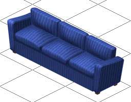
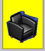
....which is what
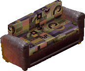
we are going to do now to this beautiful sofa from the original game.
OK, maybe I lied. It isn't really that beautiful. But it hasn't got a companion chair and that is just as puzzling as why Maxis thought we would like to use many of the objects they gave us in combination with each other. This sofa with the yellow chair from my first tutorial, anyone? So now I have made you feel nauseous with the thought of having to use that colour combination once more in your games, let's bless dear old Don Hopkins and use his spiffing program to make a new chair! |
||
|
Preparation & Generating Editable Files |
||
|
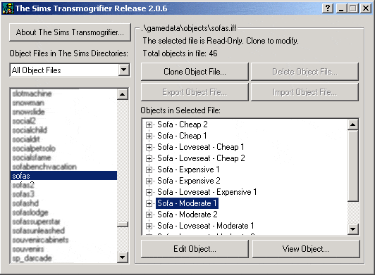
I am assuming that you have done your normal preparations like taking all your downloaded objects, walls & floors out of your folders and storing them in a safe place, so that TMog and the game will load very quickly for testing and retesting your object. I give full instructions on this in the previous tutorial if you want to refresh your memory. So, open up TMog and Photoshop, and away we go! Remember, wayyy way
back I suggested that you have a folder of sprite maps to keep for reference
at a later date? Hope you did or if not, make one now as you are going
to export some sprites into that folder right now. We want to extract
the sprites from this sofa, and as it is a Maxis object it is probably
Read-Only so you will have to clone it first. Don't forget to give it a name like SpritesBlueSofa so that you can easily find the object to delete later on, assuming that you won't want two of this delightful sofa in your game. You will see from the picture below that I have called mine "spritesbun9mogbluesofa". That also helps me find the sprite folder easily enough again in all the hundreds I have saved to disk. Assuming I will ever want to use this blue chair graphic again of course! Then again, this name will also help me when I am looking to save some space and delete unwanted files.... Actually, the sofa isn't that bad. I love the shape of it, just not the colour scheme. Once I have made my chair base, I may well retexture it several times so this certainly is a worthwhile task. |
||
|
We will look at retexturing in far more detail in a later tutorial, where I will address such issues as size, realism, shading, lighting & other optical illusions. For now, lets get this new chair made! |
||
|
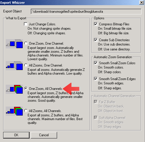
OK, we want to keep the Z and A channels exactly as the Maxis artist made them, so we are going to export them along with the P sprite. When you come to Export, therefore, make sure you uncheck "Just Change Colors" and check "One Zoom, All Channels". This will export the largest sizes of all the sprites, which for the purposes of this tutorial is all we need. Once you have exported, TMog will highlight your object, which you can merrily delete as we only wanted the sprites, so take a moment to laugh along with merry ol' Don as he gives us one of the funniest - and truest - delete confirmation messages I ever saw. And now to find a suitable object to clone, remembering that this is now just going to be a base object with little resemblance to the original. |
||
|
The basic criteria I use when looking for a base object are as follows :
|
||
|
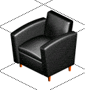
As we are making a
chair, the answers to some of those questions are pretty obvious. No point
in using a topiary as the base object for our chair, for example. So, taking all these criteria into account, I have decided that the best base to use is this chair, coincidentally also from the original game. |
||
|
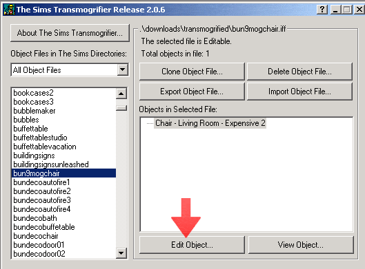
Find the chair in
TMog - it is under chairslr1tile, and is the Living Room Expensive 2.
Clone it and give it your name. As always, I am giving mine a name starting with "bun" to identify it as being mine - and keeps all my own objects together in TMog. Because it's a chair and purely for this tutorial, I will call it "bun9mogchair". Giving your object a descriptive name makes life a lot easier when you are looking for it at a later date - and of course makes life a lot easier for your downloading audience as well for compiling shopping lists or organising objects. :o) |
||
|
And now it's time to export the sprites. Although we are changing the sprite shapes, like with the sofa we still want to keep the Z and A channels exactly as the Maxis artist made them, so again we are going to export them along with the P sprite. When you come to Export, therefore, make sure you uncheck "Just Change Colors" and check "One Zoom, All Channels" as before.
|
||
|
And now to Photoshop
& what files to have open. Let's start with the chair. By now we should know that because this object only sits on one tile and has no animations, it only has one folder of sprites...
|
||
|
...and because the object only has two rotations, there are only two sets of sprites...
|
||
|
Take a moment to look at the A channels, and how they use the greys to blur out the stepped edges of the chair in the P sprites. Now let's take a look at the Z sprites. You can see they are the same shape of the chair, but also that they are almost like the chair itself only in greyscale. We will take a closer look at why this is in more detail later on as this is important to make our chair work properly in the game. For now, we are only going to work on the graphic itself and so you can close your A and Z sprites, just leaving the two P sprites open in Photoshop. Let's go and have a look at the Sofa sprites.
Because this object sits on three tiles and has no animations it has three sets of sprites. Let's take a look in the first folder....
|
||
|
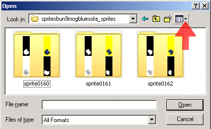
And we can see that the object has all four rotations, so we get four sets of sprites. As the base object chair only has two rotations, we only need the matching ones from the sofa folders. As we are merging the two arms of the sofa into one chair, this means we only actually need two images from the two sofa end-piece folders and none from the folder which contains the centre piece of the sofa. I have learned not
to automatically assume that because there are three folders of sprites
with numbers in ascending order means that the first set of folders contain
the first piece, the second the second etc. For the most part they are,
but there are some notable exceptions. I have found that the best way
to initially find out what lies within the folders is to either open the
NE view of the P sprites or better still, use the nifty Thumbnails selection
from the drop-down menu in the View options : OK, the views are small, but when you are dealing with an item that has lots of folders of sprites (such as an object with animations, lovebeds or other multi tiled objects) then this is an invaluable tool. Here, we can make out that the first three pictures in each folder is of the same sprite of the chair, and that 0160 is indeed the first, 0161 the second and 0162 the third. We can therefore safely ignore folder 0161 because that is the centre of the sofa, a part we do not need. What we DO need is the front and back views of the two end pieces of the sofa at the same rotations to match the views of the chair.
|
||
|
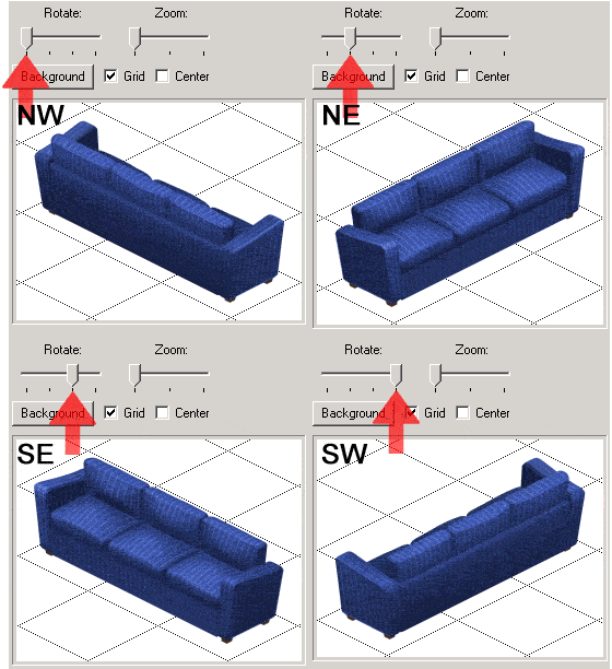
When you open each folder, you can either still use the Thumbnails selection (I actually don't use it as default because it uses a lot of the computer resources, especially if there are a lot of images in a folder) or you could go straight to the correct rotation by filename. But Bunny! I don't know which rotation filename is which! The chair sprites say "front" and "back" so I don't know which ones I need to match up! Until now that is.
The rotations of this sofa (and most - but not all - other objects) are
as follows:
So, from this diagram we can see that to match the chair sprites we need :
It is a good thing to start thinking in rotational terms because now we are becoming advanced object makers, we will be making most of our new objects with all rotations. Won't we? Yes, Bun, we will. Good. The Sims world needs good quality objects more than ever since the advent of Sims2. Back to our chair/sofa hybrid, and from the Sofa sprites you only need to open the P sprites, as we don't need the others yet.
|
||
|
And here they are in all their bright blue and yellow glory.
There is one more file you need to have open and you will find this in the BunnyWufflesTutorialKit2 folder where it revels in the glorious name of zbbsbilandbun.psd This file is a selection of various templates all based on the Transmogrifier grid in the same way the bunnewtemplates.psd was (you will recall we used it in the last tutorial). This time the templates are just based on one tile and are intended to help you keep your objects the right size, shape and placement for successful z buffers.
|
||
| There is a ReadMe txt file enclosed with it of the same name, which gives a short but VERY IMPORTANT explanation of what these templates are and do, and how to use them successfully. For the particular templates we will use in this tutorial I will, of course, be giving step-by-step details here. | ||
|
The P Sprites |
||
|
OK, now you have your two chair sprites, the four sofa sprites and the tutorial template file open in Photoshop, it's time to play "Push the Pixel"!
|
||
|
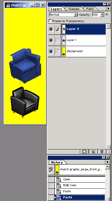
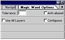
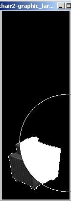
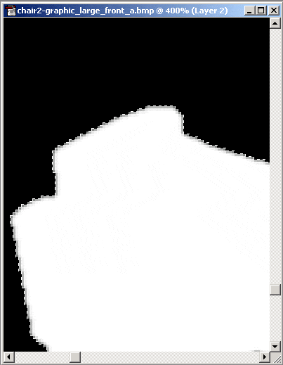
Now go to the front views of our sofa and with the Magic Wand tool, click anywhere on the lovely yellow. Now right-click and choose "Select Inverse". Those busy little ants should now be running around the edge of the sofa and so you can Ctrl_C copy and Ctrl_V paste it on top of your chair. Do this with both front views. Your image should now look something like this. As always, I have my Layers and History palettes open so I can see what I am doing to which layer and can easily go back to a previous state if I make a mistake - or series of mistakes. Don't forget also
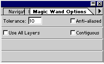
that with your Magic Wand tool, you need the Anti-aliasing and Contiguous
options turned OFF and a fairly low tolerance setting so you pick up all
the yellow but not any of the lighter pixels in the chair. Can't remember how to bring this options box up? Double-clicking any tool in the display bar will bring up its Options palette if it is not already shown on your screen.
Once you have copied the appropriate pieces over, you can minimise the original sofa images. I say minimise as we will use them again a bit later but if you need to close them to save computer resources, Photoshop might well ask you if you want to save any changes - say no, as you didn't make any changes that you need to save. Now we need to do a couple more things in preparation before playing with our blue sofa bits. |
||
|
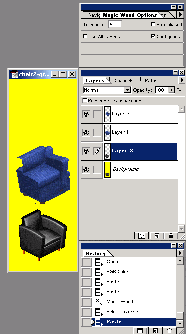
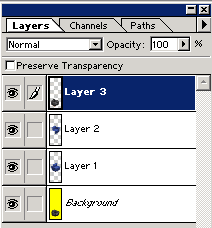
Firstly, we need a copy of the original chair without the yellow background. Use your magic wand and running ants to make a copy of the chair by going back to the background layer and copy/pasting it to make a new layer. It should be sitting in the exact same place as the background image; the only difference you should see is that there is a new layer in your Layers palette. Now, remember that wayyyyy back in the Easel tutorial we learned about Photoshop layers being a lot like tracing paper sheets? Imagine our tracing paper is in a ring binder. You don't want layer three right at the bottom; you would prefer it at the top so that the sheets with the blue sofa images on are sandwiched between the two chair pictures. So you clip open the ring fastener, take out the appropriate paper and reposition it in the place you want. Well, we can do this easily enough in Photoshop too by highlighting the selected layer with the cursor, then by clicking on the mouse, grabbing it, and hey presto, you will find you can move it up or down the layer palette "ladder". (Phew, that was almost a mixed metaphor then. But I think I got away with it.) Move the layer so
that it is above Layer 2. You shouldn't see any difference in the P sprite but look at the layers palette now where you will see the "pages" in a different order to before. To remind me what this layer is, there is a handy way of organising layers by giving them names. When we are only working with five or six layers that is not really too important, but should you ever come to work with images consisting of fifty or sixty layers, all of a sudden it is very useful indeed, especially if some of the images on the layer are so small you can't actually see them on the thumbnail picture. |
||
|
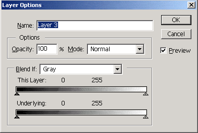
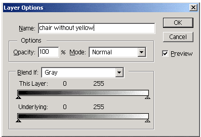
Place your cursor again to highlight Layer 3 and double-click. This will bring up a menu called Layer Options. Highlight the name and instead of Layer 3, type in whatever you want to call this layer. Because I am a boring and organised bunny, I will call this layer "chair without yellow". But you can call it whatever you like. Just remember, however, that if you choose a random word ("cake", for example, or "guess what's in this layer") when you come to working with images of the size I was talking about above, you really WILL be playing "guess what's in this layer". |
||
|
You can rename as
many or as few layers as you like! Why not have a bit of practice - but
remember, I will be the boring bun that I am and calling the layers by
the names shown and I don't want to confuse you! |
||
|
A point of interest to note is that if you have a layer which name is italicised, such as the Background layer is here, that means you cannot move that layer around. But by changing its name in this way, you can change it into a moveable layer just like the others. As we don't need to do that for the purpose of this tutorial, I am leaving mine as it is - and in fact leaving all of them as they are above.
|
||
|
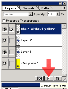
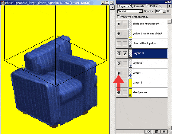
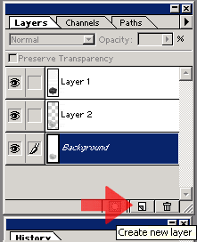
The next thing to do is create a solid yellow layer between the background and the first blue sofa bit. At the bottom of your Layers palette, you should see three little pictures. Mouse over them and they will reveal what they do. It is the middle one we are interested in as it does what it says - it creates a new layer. If I clicked it now, it would create my new layer above the "chair without yellow" layer as that is the one highlighted. I don't want my new layer there; I want it between the background and the first blue sofa bit. I could always move the layer there like we did to the chair layer, but instead I am going to highlight the background layer before clicking the "create new layer" option. Either is good. Once you have your new layer, use the eyedropper tool to sample the yellow from the sprite and use the paint bucket tool to fill the new layer. |
||
|
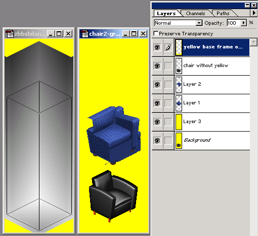
Your image should now have five layers - the background yellow with chair sprite image; the new all yellow layer, the NE blue sofa image, the NW blue sofa image and the chair without yellow. The final layer to
create goes on the top - above the "chair without yellow" layer.
Go to the zbbsbilandbun.psd template
file and click on the layer called "yellow base frame object".
Place the Move tool on this layer, and while holding down the Shift key,
move it onto your layered P sprite. This will ensure that the template
layer will snap into the exact place needed in the P sprite. Copy &
pasting will not do this, neither will moving the layer without the Shift
key. They will move the layer most certainly, but not into the exact place
we need it. Holding down the Shift key in Photoshop ensures accurate placement between points - try it using other tools, such as the Polygonal Lasso or Pencil tools.You may recall we used this technique in the second Alpha Channel tutorial when we were making the transparency for the Angel window. Your P sprite should now have six layers, just as mine has in the picture on the right. So now, it's move the blue sofa time! Keeping in mind that the "chair without yellow" and "yellow base frame object" layers are on the top, position the two blue sofa bits behind it. Obviously they won't fit perfectly. You will soon notice that some of the sofa disappears behind the yellow template frame. The frame is there to help ensure the correct placement of the object within the Transmogrifier grid, which in turn will help us no end in creating an accurate Z buffer without a huge amount of fussing around.
|
||
|
As you become more confident and practised in creating Z buffers, you will not need this template, but I actually do use it and the other templates as a matter of course for most new things I do these days. Anything for an easy life! There are a lot more templates in that file than I use in this tutorial - I use them all in different situations, and I hope you find them as useful as I do. |
||
|
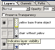
You may recall that clicking the little eye icon next to a layer temporarily renders that layer invisible to see. It will stay invisible until you click in that box again to bring back the little eye. The layer is still there all this time, but making it invisible is useful when we need to see what we are doing to the layers underneath. So click the little eye on the "chair without yellow" icon and what do you see...... |
||
|
So let's
make it better. Select your eraser tool, and make sure that in the Options
palette your eraser is set to Pencil, with 100% opacity. We need to edit this chair in sections, and first of all, I am interested in getting the two arms of the new chair in the right position before I think about the seat or the back. In my P sprite, the blue sofa bit on the top is Layer 2, and I am going to erase the parts that are obscuring the arm of the Layer 1 blue sofa part. Obviously my placement of the blue sofa bits may well differ from yours; that does not matter so long as your chair is in roughly the same position as the original black one.
|
||
|
Use the visibility and the opacity options to see what you are doing to this layer in relation to Layer 1. As well as using the eraser on Layer 2, I am also going to use the polygonal lasso tool to select parts from Layer 1 and copy/paste them to my Layer 2. Obviously the way I do my graphics is going to be different to the way you do yours, and I am leaving it up to you to use the ways you feel more comfortable with so long as we get the same result - the two arms of the chair in the final placement.
I do not want my blue chair arms to be the same shape as the black chair (otherwise I would just recolour the black chair!) but it is important for scale that they are roughly in the same place and exactly at the same angle as each other. Once I am happy with the blue chair arm of Layer 1, I can then shift/move the "single grid transparent" layer to a strategic point on that layer to help me place the Layer 2 arm correctly. Now is a good time to save your work. I am going to use "Save As" to save this sprite as a layered .psd document in case my computer crashes or I need to use the loo / get another drink / feed the cat / feed the family or any other of the myriad annoying distractions that keep me from transmogrifying 24/7. It is up to you where you keep this file; I tend to keep mine in the parent folder of the sprites files so it keeps them together. As it is a .psd document it won't make any difference to Transmogrifier when you come to import the files and your normal working folders won't get cluttered up with files of partially made objects you no longer need.
I have left the filename as it is, but the extension has now changed from .bmp to .psd. Leaving the filename intact makes it easier to save it to the right place once we come to flatten and convert the image to indexed for importing back into Transmogrifier. |
||
|
Fed up with constantly moving your cursor to the layers palette to move from one layer to the next? Here's a nifty lil' short cut to help. Using your Move tool, Right Click on the Sprite image and a little pop-up menu will appear, showing you what layers your pointer is hovering above. You can then select which layer to edit. Try right-clicking your Move tool on other areas of the sprite and you will soon notice it will only give you the layer options that your cursor point is exactly on. Moving around layers becomes a doddle using this option! |
||
|
OK, I am now satisfied with the placement of the arms in relation to the placement of the arms of the original chair AND the transparent grid. Notice I created a Layer 4 by my copying and pasting the arm from Layer 1. You can also see from this picture that I moved the transparent grid. This view is a little muddled, so let's see what it looks like without Layer 1 visible. |
||
|
With Layer 4 (my new arm) highlighted I am going to Ctrl/E merge down the arm and the remains of Layer 2. We can then work behind that to get the back and seat of the chair in place. I am going to rename this layer to "newly merged" so that I don't confuse it with the work I am going to do next. I am not worried about the base or the front at this time, I will sort those out once I am satisfied with the backrest and seat. So now, go to Layer 1, make it visible, and move it around underneath your newly merged layer until the backrest matches up. You may find it useful to move your transparent grid down to the top of the backrest so you get the angle right.
|
||
|
Erase what you need to. Lasso, copy and paste what you need to. You may even need to go back to your minimised (or reopen them now if you had to close them) NE view sofa sprites to copy and paste some or all of the front views in again. If you do copy and paste bits in (and I know I will) you need to make sure they are behind your newly merged layer. Now you can see why I renamed the layer - I don't want it confused with the remains of Layer 1, let alone all the new bits and pieces I am potentially bringing in. Don't forget:
|
||
|
I am not worried about the poorly stepped back or the blurred bit where the left hand arm meets the seat. We will deal with those details in a moment. What I am going to
do now is Ctrl-E merge down all the bits of the chair that are visible
so I don't accidentally move or erase bits when tackling our next part
- editing the bottom of the chair. I am going to rename this layer too,
so I don't accidentally do anything to it I didn't want to. As you can see, it's now imaginatively called "new chair". You can also see that I am a tidy bunny and have deleted unwanted layers and made some layers invisible. Again, when editing the bottom of the chair you will no doubt need to bring in bits or all of the NE view sofa sprites. This time, bring them in ABOVE the "new chair" layer so you can see what you are doing. It is important to keep the "yellow base frame object" layer visible throughout this next part. We want this chair to sit in the same place as the original black chair and that template will help us do so. |
||
|
I find that by lassooing some of the yellow from the NE sprite in with the blue of the chair helps tremendously in getting the shape right, and you might well find the same. So, this is what my chair looks like now, and you can just about see that my Layer 6 and Layer 7 were taken straight from the NE sprites, yellow and all. I am very happy with this so I am going to merge them down with the new chair layer. We can then start to sort out the wrongly stepped pixels and some of the artistic bits of the chair itself. Don't forget to save!
|
||
|
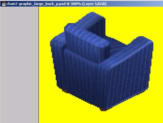
Before we start editing the finer details, zoom back to 100% then click the eye box on the "chair without yellow" layer to see how your new chair compares to the old one. This is mine, but yours may not be as big - or may even be bigger! So long as the seat is in relative proportion to the seat of the other, it is fine. After all, the sofa is big & chunky and we want the new blue chair to match the sofa - not the black chair! |
||
|
Click the eye box again and zoom up to your preferred magnification for editing single pixels. I like 300% or even 400% for this but I guess it depends on your screen resolution - and your eyesight! With your eyedropper
tool, select some of the blue for the foreground colour and yellow for
the background colour. You will recall that you use the icon in your toolbar
with the little double sided arrow to switch between background and foreground,
and click the little black & white boxes to restore to - well - black
& white. You may well need to change the blue several times depending
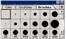
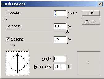
what part of the chair you are editing. We set the eraser tool options earlier, and now we should change our pencil tool options in the same way. Now let's use the pencil and eraser tools to tidy up those steps. I am actually going to make a new layer to do this so I don't permanently lose any of the image I have spent all this time working on. The history palette only goes so far back, and sometimes I get carried away when sorting out stepped pixels and forget to save. Just let me take a moment to remind you that we learned in the third tutorial that ALL straight edges in the game are two pixels wide - so if you want to use a two-pixel sized brush and there isn't one in the default Photoshop brushes, don't despair. Did you know you can change your brush sizes by right-clicking on an existing brush? Try this with the single pixel and you should get a Brush Options box (pictured below right) pop-up. |
||
|
I doubt if you would want to change this useful brush though - so pick another one, preferably one you don't use. Double click it, and you can either change the pixel size in the Diameter slider or type it in the box. I changed the brush below the single pixel in my Brushes screenshot (above) to a two pixel one as I realised I never used the one that was there before. You will also see a brush of 999 pixels in my screenshot above - I needed a huge brush for a recent project (non-Sims) and never got round to changing it back. That's how organised I really am! :o)
|
||
|
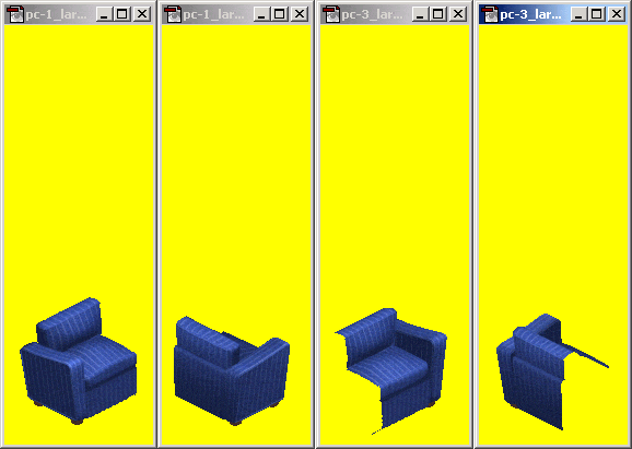
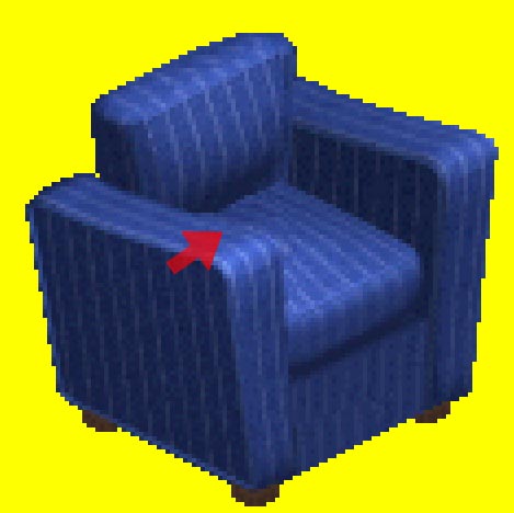
Now let's tidy up the graphic itself. I am really not too happy with the blurry bit where the left hand arm meets the cushion, as demonstrated by the red arrow. I am not too happy with the red arrow either but that is just for this screenshot ;o) I am going to cut and paste that section from the NE sprite. While I am doing that, I will also cut and paste some of the front of the base of the chair - you can see from my screenshot that the pinstripes of the chair break off halfway. But as I said above - don't forget to reduce the size to 100% from time to time so you can see roughly what the chair will look like in the game. It is easy to forget that when you spend a lot of time working up close, mistakes that look obvious at 400% may well probably not be noticeable at all in the game. When working on the graphics rather than the shape, you may want to change your eraser options to "paintbrush" to help blend images without those blocky steps that the "pencil" option gives you.
Don't go anywhere near the yellow with that option checked though. While we could sort out mistakes like that with the A channel, that is only making unnecessary work for ourselves. |
||
|
And here is the final product! Well, for the front view anyway. Compare this to the "new chair" layer and you can see a vast improvement. Save your .psd file, and we can now actually save this chair file as a P sprite. You can do this in two ways: |
||
With this method, if you want to retain the layers in your Photoshop file, use the History palette to go back to just before you flattened the image and save it again. Do this now, otherwise you may well forget and save the flattened file - with no way to get back the individual layers once the file has been closed. |
||
With this method, if you have renamed your .psd document it is easy to forget the original filename of the particular sprite and/or its folder. |
||
| Now that your shiny new P sprite has been saved, minimise it and let's take a look at the back of the chair. As we are going to follow the exact same procedure for the back part of the chair as we did the front, I am fairly confident that I can now leave you on your own to complete it. Go here to remind you of the steps to take - without forgetting we are now editing using the NW sprites and not NE :o) | ||
|
Save this in your preferred way - as above I have saved it as both a layered .psd file and an indexed .bmp file in the chair folder. You can close the .psd files now, and also the sofa bits if you already haven't done so. And this concludes the work on our P sprites! |
||
|
The Alpha Channels |
||
|
Now let's make some Alpha channels! Open up the chair2-graphic_large_back_a.bmp and chair2-graphic_large_front_a.bmp files from your chair folder. You should now have open in Photoshop the following files:
|
||
|
We are going to be
working in greyscale now, so first, convert your two A sprites to Greyscale.
Photoshop will ask you if you want to "discard the color information",
and the answer is OK.
|
||
|
Go
to your toolbar and click the little black & white boxes to restore
the background & foreground colours to black & white, and ensure
that your pencil and eraser tools are still set up as above.
Let's do the front view first. Go to the front view of the P sprite, select all and Ctrl-C copy & Ctrl-V paste the entire image into the front view of the A sprite. You will see that you have your chair perfectly rendered in shades of grey on what looks like a white background similar to my image here on the right.
Using your magic wand, click anywhere in that white area and delete it.Your image should now look something like the one below on the left. You can see with mine that some of the original object's white image is showing through. To get rid of it, you could either use your pencil tool and draw over it with the pure black, or fill with the paint bucket. |
||
|
I actually like to edit on new layers wherever possible in case I make a mistake I can't go back and change on the history palette. So I am going to create a new layer between the background and the chair image, and using the paint bucket fill it completely with solid black. Once you have done that, if there are still any stray white pixels, they have made their way across from the P sprite and you should now switch to your grey chair layer and use the eraser tool to get rid of them. Our chair is dark in colour so we can be confident that they are not a light colour in the object we need to preserve. You should now be left with your dark grey chair image on a pure black background. Still in the chair layer, click anywhere in the pure black with the magic wand, then right click / select inverse. With your pencil tool on a large brush (I use 200) and with the pure white as foreground colour, scribble all over the A sprite. You can see from the image on the right that the pencil is only selecting the chair image to colour in. Once you are sure that all the chair image is covered in white, merge the chair with the pure black layer. |
||
|
Now, with the white
chair selected, go to the top menu and click Filter. From the drop-down
menu pick Blur. Do that once more and you should end up with a result
something similar to mine here on the left. Because we inverse-selected the white image, the blur is confined to within the selection - which is exactly what we want. Had we not merged the white image with the black background first, the blur tool would just have had white to blur with, and there would be no discernible difference to the image. You will recall that in the A channel sprite, the darker the image, the more transparent the image is in the game. The pure black takes this to the extreme - totally transparent. The pure white goes to the other extreme - completely opaque. It is in the shades of grey that the interesting stuff happens*, and what we have done here is reduce the blockiness of the edges of the chair. This A channel is fine for the moment - if later on when we are testing our object in the game we think the edges are still too blocky, we can always go back and edit it further.
*Just like life I suppose. Viewing it in shades of grey is usually far more interesting than seeing everything in black and white :o) |
||
|
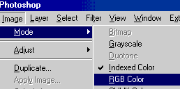
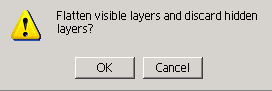
Go back to the menu bar, choose Image/Mode/Indexed, and when Photoshop pops up and asks if you want to "Flatten visible layers and discard hidden layers?", the answer is OK.
Save the file and now repeat this process with the back of the chair P sprite and its A channel. Save that file and that's your A channels done! Minimise the A channel files to keep the history palettes intact and leave your P sprite files and Z buffer template file where they are as we will be using these in our next step. |
||
|
The Z Buffers - a little bit of theory first |
||
|
Oh my how scared of Z buffers I used to be. OK, in the list of "things quite rightly to be scared of in life" admittedly Z buffers did come very low on the list, but for something as esoteric as a portion of digital data reserved for distance information it sure produced very real and very scary feelings in the pit of my stomach whenever I encountered one. But trial and error and plenty of experience using Bil's Z buffer templates has mostly cured me of the terror. OK, so it has replaced the feelings of terror with feelings of tedium but I know which I would rather experience - especially at the hands of a pixel. Do pixels have hands? Well, you know what I mean. As we progress through this tutorial, I hope to pass on some of the experience I learned from my mistakes so that you don't have to endure the long learning curve I had on handling what is essentially our friend in sims object creation. And for me, the key to cracking the code of the perfect Z buffer was understanding what they are and why they are necessary. OK, let's start. Remember the cube graphic from the previous tutorial? And that I said that the Z buffer handles the depth information for the object? |
||
|
How many chairs have you downloaded (or tried to make) where when the sim sits in it, his or her bottom pokes out of the chair? That is all controlled by the Z buffer, and until you understand why that happens, chairs could elude you for some time yet. I know this all too well - which is why my first ever completely home made chair came only five years after my first ever recoloured object. Yes folks, it took me that long to pluck up the courage to try once again. But now I am getting more confident with them, it doesn't mean to say that they are any the less fiddly - just that they are not so mysterious with it. When we come to make our Z buffer for our new chair, it is therefore important for us to know which bits go behind the sim and which bits go in front of the sim. |
||
|
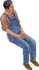
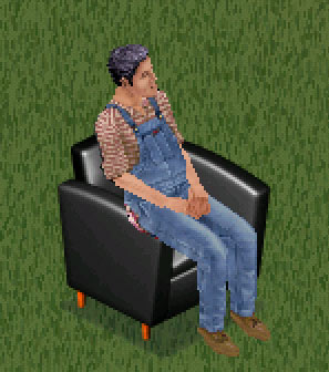
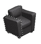
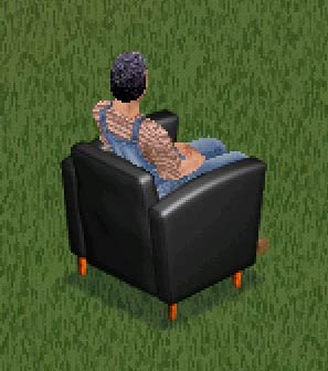
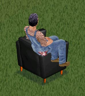
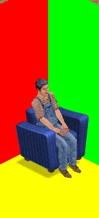
Z buffers work in a similar way to the A channel with blacks, whites and greys controlling the basic action, but in far more detail and with gradients controlling the distance information. The part of the chair the sim sits on is lighter than the arm of the chair facing us. That is because when the sim sits on the chair, he or she is obscured by part of the arm - as if the arm of the chair is in front of the sim. With the back of the chair, it is the other way round. That is because there is very little sim showing from the back view. To demonstrate this it's now time to meet Mr Chair Tester (pictured right). He holds a very important - but very easy - job in the Wuffles neighbourhood: he sits down all day. |
||
|
Open up another file which you will find in the BunnyWufflesTutorialKit2 folder where it lurks under the rather pedestrian name of mrchairtester.psd
This is a Photoshop layered file showing the relationship of the chair to its Z buffer, and the relationship of Mr Chair Tester (from now on referred to as MCT) to both chair and Z buffer. Ignore the little squiggly icons next to the eye - they have no relationship to this tutorial (but we will be learning about them in the next one!) Let's look at this file step-by-step together right now. There are two sets of files, one dealing with the front Z buffer and the second dealing with the back. For the moment, we are only going to be looking at the first set - we will look at the ones prefixed "Back view" when we come to create our Z buffer for the back view of our new chair. Reveal the layers (using the box with the eye) with me - where you see that I have said something like "Layers visible: MCT on chair / MCT without chair." you will need to have these same layers visible and the rest invisible.
|
||
|
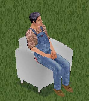
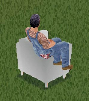
Layers visible: MCT on chair. You can see here that part of MCT's posterior and thigh are obscured by the chair. Well, this is not really so - this is an optical illusion caused by the Z buffer. You will recall that although The Sims has a 3D look, it is actually only a flat 2D game. The sim therefore could not be obscured by anything on the same tile without the behind-the-scenes work of the Z buffer. So how much of MCT is "behind" the arm of the chair? |
||
|
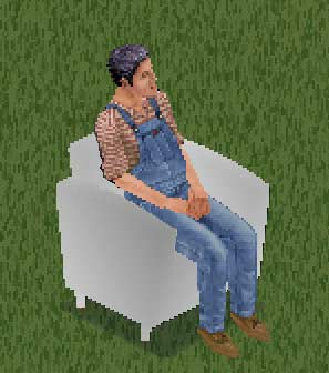
Layers visible: MCT on chair / MCT without chair. You can now see there is a fairly sizeable part of MCT's posterior which should be behind the chair arm. If this happened because of the Z buffer, that would mean that the portion of buffer behind the offending bit is too light. |
||
|
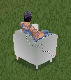
Layers visible: MCT on chair / Chair z buffer / MCT without chair. By superimposing the Z buffer image exactly on top of the chair, we can start to see the portion of the Z buffer that needs special attention.
|
||
|
Layers visible: MCT on chair / Chair z buffer / MCT without chair / Chair arm z buffer. Here, I have cut out the arm of the chair from the Z buffer and superimposed it in the right place but above MCT. |
||
|
Layers visible: MCT on chair / Chair z buffer / MCT without chair / Chair arm z buffer / Area where z buffer meets MCT. Here, I have selected the portion of the chair arm which intersects with MCT. The running ants give you an exact indication of where we need to pay attention to the Z buffer. This is the part we would have to darken if this problem was due to the Z buffers. The final layer just shows the bit of MCT which needs to "go behind" the arm of the chair.
Minimise this file for the moment until we come to look at the back view. |
||
|
Making Our Z Buffers |
||
|
Now let's make some Z buffers of our very own! Open up the chair2-graphic_large_back_z.bmp and chair2-graphic_large_front_z.bmp files from your chair folder.
...and
they should look like this:
|
||
|
Click the little boxes to ensure your background and foreground colours are at the default black & white. Your pencil, eraser and magic wand options should not have changed from above. |
||
|
You will see that you have a very familiar image - your chair perfectly rendered in shades of grey on what looks like a white background. Just like we had at this stage in the A channel process! This should be called Layer 1. Now, select your Background layer and, using your magic wand, click anywhere in the white part, right-click & select inverse. This should select the whole of the chair z buffer, and then Ctrl-C copy & Ctrl-V paste to create a new layer - Layer 2. The three chair images should all be lined up in exactly the same place. Go back to your Background layer, and make a new layer inbetween this and your Layer 2. Using the paint bucket tool, fill this layer with the pure white. This will be Layer 3. |
||
|
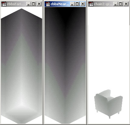
Bil Simser's two marvellous Z buffer templates are two of the layers in this template file, and let's have a look at how they relate to the original chair Z buffer before we use them to make our own. Imagine if MCT was magically transported to Z buffer land. He would be standing exactly in the centre of the "z buffer far large" layer and we could see him perfectly. He could move about in that sprite and we would still see him perfectly wherever he went. But if he was standing exactly in the centre of the "z buffer near large" layer we wouldn't see him at all, no matter where he went in the sprite. You can see from the diagram here that the front chair Z buffer is therefore a composite of BOTH buffer templates. The chair which goes behind MCT (that he sits on) is from the "z buffer far large" layer, while the arm of the chair which goes in front of MCT is from the "z buffer near large" layer.
|
||
|
The next layer for our Z buffer will be dragged from the zbbsbilandbun.psd template file. Click on the layer called "z buffer far large". Place the Move tool on this layer, and while holding down the Shift key, move it onto your z buffer image. As we learned before, this will ensure that the z buffer template will snap into the exact place needed. Your layers palette should now look like this: |
||
|
Now, go back to Layer 1 and using the magic wand, click anywhere in the white of the image. Press the Delete key, but do NOT deselect the running ants. Instead, highlight Layer 2 and press Delete, then highlight the "z buffer far large" layer and press Delete once again. Deselect the running ants and make Layer 1 invisible. The image should now look something like the one on the left here. We have kept a lot of the original chair Z buffer on the principle of "if it ain't broke, don't fix it". But the new bits of the chair needed a Z buffer too so that is where Bil's template came in.
Highlight Layer 2 and Shift/Move the "z buffer near large" layer from the template file. Move back onto Layer 4 and using the Magic Wand, click anywhere outside the arm image. Right-Click & Select Inverse so the ant marathon is around the edge of the arm of the chair. Go back to the new "z buffer near large" layer and press Delete. |
||
|
Deselect the running ants and make Layers 4 and 1 invisible. Your image should now look something like mine on the left. Go back to the menu bar, choose Image/Mode/Indexed, and when Photoshop pops up and asks if you want to "Flatten visible layers and discard hidden layers?", the answer is OK. Save the file as that's your first Z buffer done! Minimise this to keep the history palette intact and let's turn to the back of the chair. Open up the mrchairtester.psd file once again. |
||
|
Layers visible: Back view MCT on chair. You can see here that most of MCT's back, posterior and legs are obscured by the chair. |
||
|
Layers visible: Back view MCT on chair / Back view MCT without chair. You can now see there is a fairly sizeable part MCT which should be behind the chair. If this happened because of the Z buffer, that would mean that the portion of buffer behind the offending bit is too light. |
||
|
Layers visible: Back view MCT on chair / Back view Chair z buffer / Back view MCT without chair. By superimposing the Z buffer image exactly on top of the chair, we can start to see the portion of the Z buffer that needs special attention.
|
||
|
Layers visible: Back view MCT on chair / Back view Chair z buffer / Back view MCT without chair / Back view chair back & arm z buffer. Here, I have cut out the back of the chair from the Z buffer and superimposed it in the right place but above MCT. |
||
|
Layers visible: Back view MCT on chair / Back view Chair z buffer / Back view MCT without chair / Back view chair back & arm z buffer / Back view area where z buffer meets MCT. Here, I have selected the portion of the chair which intersects with MCT. The running ants give you an exact indication of where we need to pay attention to the Z buffer. This is the part we would have to darken if this problem was due to the Z buffers. I hope you found MCT useful. You can close him now as I will not be referring to him again - but obviously you can leave him open for reference if you like. |
||
|
So in conclusion, we have seen that the back of this chair is mostly going to be in front of the sim. Again, imagine poor ol' MCT trapped in Z buffer land. We can see him no matter where he goes in FarLarge but not at all in NearLarge. And true to what we are learning, we can see that when we look at the chair Z buffer, for the most part it resembles Bil's "z buffer near large" template.
|
||
|
So you should now repeat the above process with the back of the chair P sprite and its Z buffer only instead of cutting out the arm of the chair, this time you will be cutting out the back and arm of the chair to use with Bil's "z buffer near large" template. |
||
|
My finished Z buffer layered file looks like this and yours should hopefully look very much the same. Go back to the menu bar, choose Image/Mode/Indexed, and when Photoshop pops up and asks if you want to "Flatten visible layers and discard hidden layers?", the answer is OK. Save that file and that's both your Z buffers done! Once again, you should just Minimise the Z buffer file to keep the history palettes intact.
Already I can see that the A channels on the slopes of the chair arms are not really very nice. They may well look different in the game though, so I am going to leave them for the moment.
|
||
|
Once you have imported your chair and had a good look, close Transmogrifier but keep Photoshop open. It is time to look at this fine new object in the game! You MUST close Transmogrifier first; if you leave it open while loading the game, the game will not load any objects as they are being read by TMog. In fact, you must also close Transmogrifier if you are using this object in almost any other way - especially if you are wanting to use Sim Explorer, WinZip (or WinRAR) or even to simply move it from one folder to another. But first, you need to find and install some files from the first BunnyWufflesTutorialKit. There are two folders containing seven walls and floors which are not in the least bit attractive - but they are incredibly useful in that they allow us to check the positioning of both the object and its Z buffers in the game. They are priced at 1 simolean so they are easy to find in your game - even easier if you have temporarily moved all your custom walls and floors out to make the game load quicker during testing. You will find these in a folder called Bunmogwallsfloors which itself contains two subfolders (one for walls, one for floors) which you should put straight into your main walls & floors folder. This way you can move them out easily enough when you just want to play the game. |
||
|
Placing the original sofa next to it, I can see straight away that I am not at all happy with the chair A channel. Ew ew ew. Still blocky and too fuzzy in general, especially when compared with the A channel on the sofa. Because we only minimised our A channel files, we can go back and remedy this very easily indeed using the history palette, and because we exported all channels of the sofa, we can even cut & paste from those A channels to ensure they are identical. Again, if it ain't broke, don't fix it. Maxis' A channels were perfect on the sofa, so let's use them on the chair.
|
||
|
So, what happens when MCT has a nice sit down? Well, at this rotation, it looks as if the Z buffers are perfect for our needs. There is no chair poking through MCT where it shouldn't be, and MCT doesn't poke through the chair where he shouldn't. If you followed my instructions above carefully, yours should have this same result. What about the back rotation? |
||
|
If you can't quite tell at this zoom how good the buffers are, taking screenshots and using the magnify tool in Photoshop will help greatly. So what about the other angles? |
||
|
The good news is that this may well not actually be a Z buffer problem as such, and can therefore easily be sorted out using the X and Y rotations in TMog. How I know this is that the chair back is too close to the wall in this rotation. We made this chair slightly bigger than the original chair but kept the placement the same. There may well be a small Z buffer problem too, but we will find that out and deal with it later. For now, take a screenshot and save it in Photoshop. We will use this as a reference tool! |
||
|
Once you are satisfied with looking at your chair in all rotations and magnifications and that you have the screenshots you require to help you fix any problems, save your game and close it. Once it has finished closing, open up Transmogrifier once again. First, I am going to sort out those horrible A channels! Restore your A channel files, and using the History palette, go back to the moment before you Indexed the file. This will restore all your layers. I am leaving it up to you as to how you repair that A channel. I actually went right back to the beginning, and made a mask by going back to the original chair image we pasted on from the P sprite, and using the paint bucket, filling in the white with black and then deleting the original chair image using the magic wand/select inverse tool. I then did some up-very-close copying and pasting behind this mask using the relevant bits of the A sprites from the Sofa folders, making absolutely certain I have them positioned in the exact right place.
It would have been much easier for us had we done this in the first place. But I wanted to show you different techniques, and anyway, it may not always be possible to copy A channels from another, especially if your object is a completely different shape from anything else. So you really need to know as many techniques as possible to get a good A channel.
|
||
|
Convert your newly amended images back to Indexed and save, then import the chair back into Transmogrifier. Oh yes, a vast improvement. And no yellow pixels anywhere - this can easily happen when copy & pasting in the A channel if you are not very careful indeed. Now to sort out that pokage problem.
|
||
|
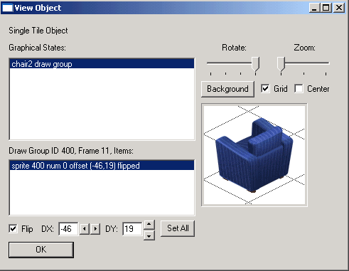
Here is the offending article in Transmogrifer, where we will recall that this is the SW rotation. Take a look at the X & Y placement - and now compare this to the placements on the other rotations. These should be the same placements as the X & Y on the original chair - you can take a look if you like but that doesn't affect what we are doing now. And what do you know. Dear ol' Maxis got the X & Ys wrong in the first place. They should be roughly symmetrical with the opposite rotation - and here you can see that this one is -46x and 19y whereas the opposite rotation is -48x and 19y. |
||
|
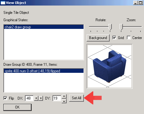
And now here comes something we must all fall on our knees and thank Don Hopkins profusely for. The red arrow is pointing to a brand new button - Set All. This replaces the mathematical formula of half-and-half in calculating the positioning of the smaller zooms and saves so much time! Press this button and more of Don's unique brand of humour will pop-up... |
||
|
Close Transmogrifier and open up the game again. This is where you will be thankful you took stuff out of the game to make it load faster. |
||
|
And just look at that. Not a blue pixel in sight! But Bunny, wait a moment. You said in an earlier tutorial that once you move something in the X and Y placement you will alter your Z buffer. This is absolutely true, and we did alter the Z buffer - for the better. It was the chair that was in the wrong X and Y placement, and by altering that and leaving our new Z buffer alone, we fixed the problem. You can see at all rotations and zooms that the chair does not bleed through any more, and that MCT interacts with the chair perfectly. Place objects near the chair and they interact perfectly too. My final check is placing the chair in a corner to see if it bleeds through anywhere. Oh and while we are there, let's also look at our new A channels... |
||
|
So that's it - our first Z buffers from scratch. And aren't they good! I am truly hoping you now understand more about how Z buffers work and how to be successful with them after this tutorial. I hope you found that they are really not that difficult - just fiddly and tedious. But by using Bil Simser's Z buffer templates, and some of my template masks, I am also truly hoping that the whole process becomes quicker and more routine each time you attempt one. |
||
|
The Fun Bit! |
||
|
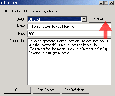
Now is the time to let your imagination run riot as it's time to write a description for your chair! Press the Edit Object... button on TMog and up will pop a screen called... |
||
|
... Edit Object. Give your chair a new name, price, and description. This is the description which pops up in the game when you select the object, so be as florid as you like. The only thing I would specify here is that you add to the description the following:
|
||
| Once you have done this, it is IMPORTANT to press the Set All... button. If you ever wondered why some of my objects only have the default descriptions, look at it in TMog - and select UKEnglish under the Language pick list. Hey presto, there's my description! Pressing the Set All button stops this from happening and anyone playing the game in whatever language they prefer will get the description you worked long and hard at. | ||
|
And that's it! You have now gained valuable experience in editing your A channels, and made your very first complete Z buffer. The next tutorial will reference back to this one quite heavily, as we go on to making a completely brand new multi-tiled object with all new P sprites, A channels and Z buffers for the first time. |
||


|
![]()
 This
is the biggie! It a much longer tutorial than some of the previous ones,
through necessity. But like the others, it consists of several steps all
hopefully easy to follow, and I am assuming you followed all the previous
tutorials. If you didn't, you really should go back and take a look because
I will be making assumptions and using terminology of steps and processes
learned in those first lessons - especially with A sprite transparencies,
Z buffers and working in layers.
This
is the biggie! It a much longer tutorial than some of the previous ones,
through necessity. But like the others, it consists of several steps all
hopefully easy to follow, and I am assuming you followed all the previous
tutorials. If you didn't, you really should go back and take a look because
I will be making assumptions and using terminology of steps and processes
learned in those first lessons - especially with A sprite transparencies,
Z buffers and working in layers. 
 ...and
a matching chair.
...and
a matching chair. 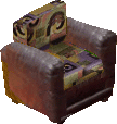
 The reason for the similar placement, shape and size will become clear
to you as you progress through this tutorial. And of course if the shape
you want for your new object is more like another user object than a Maxis
one, "is that user object cloneable or not" becomes very important!
The reason for the similar placement, shape and size will become clear
to you as you progress through this tutorial. And of course if the shape
you want for your new object is more like another user object than a Maxis
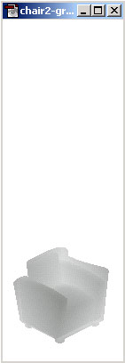
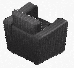
one, "is that user object cloneable or not" becomes very important!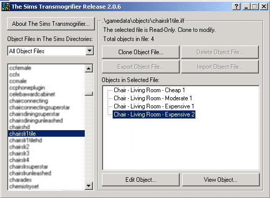 This is going to be your new object.
 So
here's our Layers palette with our renamed layer.
So
here's our Layers palette with our renamed layer.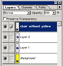
 We
can now start to erase the parts of the blue sofa we don't want in our
final chair, and to do this, we need to hide the copy of the original
black chair.
We
can now start to erase the parts of the blue sofa we don't want in our
final chair, and to do this, we need to hide the copy of the original
black chair. 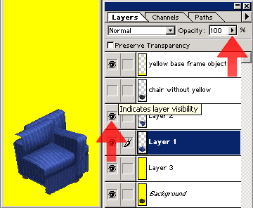 Oh
my word. What a spectacularly horrid blue mess we have made!
Oh
my word. What a spectacularly horrid blue mess we have made! 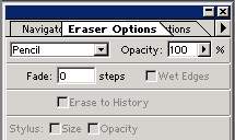 I generally use the Zoom tool to enlarge the image to at least 200% or
300% so I can get up close and personal with the pixels.
I generally use the Zoom tool to enlarge the image to at least 200% or
300% so I can get up close and personal with the pixels.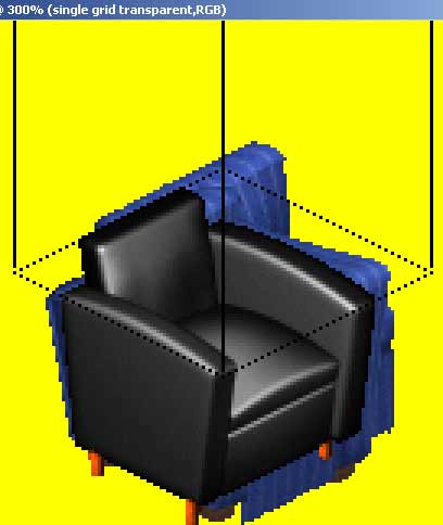 I
also use the "single grid transparent" layer from the zbbsbilandbun.psd
templates file to ensure both the arms are at the same angle. Although
I moved the file over using the Shift key, I also moved it upwards in
the sprite (also using the Shift and move option) to the point where the
arm of the black chair angles downwards.
I
also use the "single grid transparent" layer from the zbbsbilandbun.psd
templates file to ensure both the arms are at the same angle. Although
I moved the file over using the Shift key, I also moved it upwards in
the sprite (also using the Shift and move option) to the point where the
arm of the black chair angles downwards.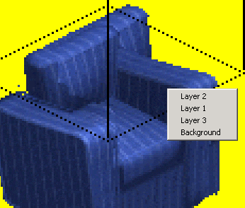
 That's
better. It almost looks like a completed chair!
That's
better. It almost looks like a completed chair! And
this is what my chair looks like now!
And
this is what my chair looks like now! 
 .
.
 OK,
here's my finished shape. I really only had to change some of the bottom
of the chair, the chair leg on the far right and a few pixels on the back.
OK,
here's my finished shape. I really only had to change some of the bottom
of the chair, the chair leg on the far right and a few pixels on the back.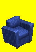
 ...and
this is my final product for the back view.
...and
this is my final product for the back view.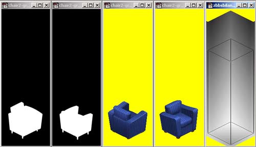 ...and
they should look like this.
...and
they should look like this.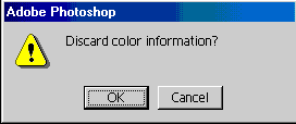
 Reset
your magic wand options to the lowest tolerance possible. We don't want
any grey in our A sprites unless we put it there deliberately.
Reset
your magic wand options to the lowest tolerance possible. We don't want
any grey in our A sprites unless we put it there deliberately.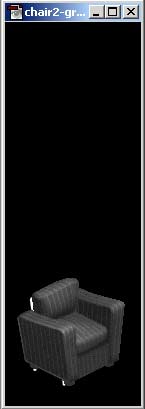
 Magic
wand anywhere in the black, right click and select inverse.
Magic
wand anywhere in the black, right click and select inverse.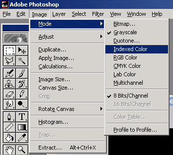
 With
an object like a sculpture, the Z buffer is quite simple. But
with an object like our chair which the sim interacts heavily with, it
is more complex.
With
an object like a sculpture, the Z buffer is quite simple. But
with an object like our chair which the sim interacts heavily with, it
is more complex.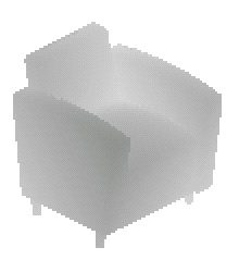
 Cast
your mind back to when we took a look at the Z sprites at the beginning
of this tutorial. You can see they are the same shape of the chair, but
also that they are almost like the chair itself only in greyscale.
Cast
your mind back to when we took a look at the Z sprites at the beginning
of this tutorial. You can see they are the same shape of the chair, but
also that they are almost like the chair itself only in greyscale.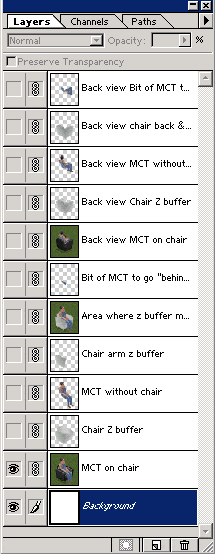

 You
should now have open in Photoshop the following files:
You
should now have open in Photoshop the following files: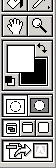
 We
are now going to use a combination of Photoshop layers and our templates
to make our Z buffer. Let's do the front view first. Go to the front view
of the P sprite, select all and Ctrl-C copy & Ctrl-V paste the entire
image into the front view of the Z sprite.
We
are now going to use a combination of Photoshop layers and our templates
to make our Z buffer. Let's do the front view first. Go to the front view
of the P sprite, select all and Ctrl-C copy & Ctrl-V paste the entire
image into the front view of the Z sprite.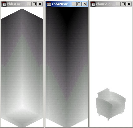 Now
go to the zbbsbilandbun.psd
template file.
Now
go to the zbbsbilandbun.psd
template file.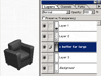
 Now
go back to Layer 1 and enlarge to 200% or 300%. Using your polygonal lasso
tool, select the arm of the chair which should go in front of the sim.
Ctrl-C copy & Ctrl-V paste to create a new layer - Layer 4. You may
well need to reposition this arm until it matches the chair image from
Layer 1 exactly.
Now
go back to Layer 1 and enlarge to 200% or 300%. Using your polygonal lasso
tool, select the arm of the chair which should go in front of the sim.
Ctrl-C copy & Ctrl-V paste to create a new layer - Layer 4. You may
well need to reposition this arm until it matches the chair image from
Layer 1 exactly.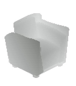

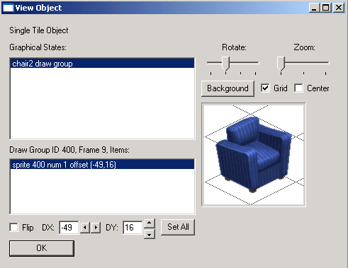 We
are now ready to import the chair back into Transmogrifier where it should
look something like mine on the right here :
We
are now ready to import the chair back into Transmogrifier where it should
look something like mine on the right here :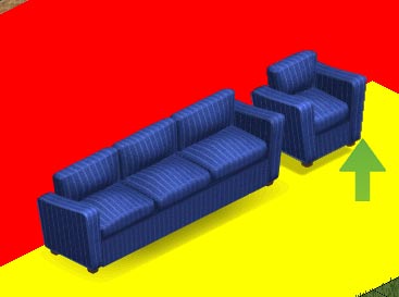 Load
up your game to whatever neighbourhood & lot you reserve for testing.
Here you can see I built an L shaped wall, with the lovely bright red
wallpaper and the yellow floor as a contrast to the blue of the chair.
And what a contrast it is! Yum.
Load
up your game to whatever neighbourhood & lot you reserve for testing.
Here you can see I built an L shaped wall, with the lovely bright red
wallpaper and the yellow floor as a contrast to the blue of the chair.
And what a contrast it is! Yum.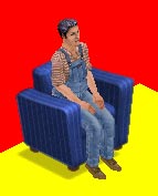
 At
this rotation, it looks as if the Z buffers are also perfect for our needs.
Again, there is no chair poking through MCT where it shouldn't be, and
MCT doesn't poke through the chair where he shouldn't. And again, if you
followed my instructions above, yours should be like this too. Fantastic
news!
At
this rotation, it looks as if the Z buffers are also perfect for our needs.
Again, there is no chair poking through MCT where it shouldn't be, and
MCT doesn't poke through the chair where he shouldn't. And again, if you
followed my instructions above, yours should be like this too. Fantastic
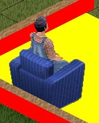
news! Eep!
A serious amount of pokage there! I'm guessing yours is the same - but
if it isn't, my heartiest congratulations are most certainly due!
Eep!
A serious amount of pokage there! I'm guessing yours is the same - but
if it isn't, my heartiest congratulations are most certainly due!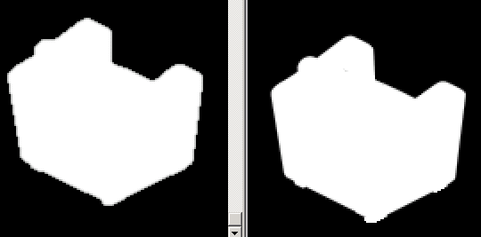 And what a difference
already! Now I am going to let you into a little secret here....
And what a difference
already! Now I am going to let you into a little secret here....
 So
first, I am going to change this X & Y offset channels on this rotation
to match. You will hardly notice the difference in the placement of the
chair, but this will make a huge difference once we see the chair in the
game as we are moving the chair position in the sprite but not altering
our Z buffer.
So
first, I am going to change this X & Y offset channels on this rotation
to match. You will hardly notice the difference in the placement of the
chair, but this will make a huge difference once we see the chair in the
game as we are moving the chair position in the sprite but not altering
our Z buffer.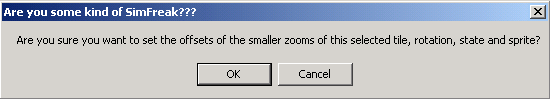 ...and
the answer is OK.
...and
the answer is OK.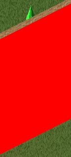
 Oh
yes, those A channels are good. And by rotating the view and zooming out,
we can see that both the A and the Z channels are good. All in all, a
perfect chair.
Oh
yes, those A channels are good. And by rotating the view and zooming out,
we can see that both the A and the Z channels are good. All in all, a
perfect chair.