|
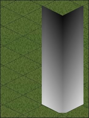
It sort-of makes sense if you place the template on a tile, remembering that you, as the viewer,
are somewhere high in the air looking down at a constant angle (you'll have to imagine the perspective). The dark
bits are the parts closest to the viewer, ie. the centre, while the top is almost black because that is where you
are viewing from. |


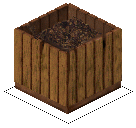
| Depending on what your monitor is set at, the compost z-buffer may or may not look a bit stripy! Pick it up and drag it now with your cursor and put it over the template — you'll be able to match up the greys exactly and see where they came from. Go on, try it — it'll work right now in your browser. |




| This is the 'Far' template. Again, think of it sitting on a tile in the game — the area furthest away from the viewer is the farthest corner of the tile — the lightest greys. |
| Andy Warhol's painting would hang about mid-height on the left 'wall'. Again, drag the painting's z-buffer with your cursor and see where it matches. |

|
The back of the painting is closer to you as the viewer, so you have to take the z-buffer greys
from the 'Near' template.
|
|
Drag the
painting's z-buffer. |
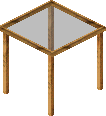

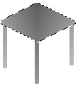


| A table I made yesterday. |
| It needs the 'Near' z template for the legs, but you don't want the table surface to be 'near' to you as well. You may want your Sims to put things on the table. |
| I used the Maxis cheap counter as a template, selected the table top and pasted the counter's top surface into it. |
|
Even using Bil's templates, you still might (often!) need to tweak here and there. Other strategies include the
Lighten/Darken tool set at about 15% and used with the lightest touch, or Adjust/Brightness/Contrast — increasing
or decreasing the brightness of the whole image in steps of +8 or -8.
|

 Z
Buffer Tutorial
By Koromo
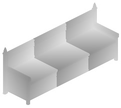
Firstly, you need to download
these z buffer templates ![]() With many grateful thanks to Bil Simser *mwah* not only for allowing me to host
them, but for making them in the first place:o)
With many grateful thanks to Bil Simser *mwah* not only for allowing me to host
them, but for making them in the first place:o)